A Shopify store can look polished, load fast, and still miss revenue every day. That usually happens when traffic is arriving, but the buying experience creates just enough hesitation to stop the sale. This Shopify conversion optimization guide is built for brands that want more than a nicer storefront. It is for businesses that want stronger performance from the traffic they already paid for, earned, or built through search and social.
Conversion optimization on Shopify is not about random app installs or chasing trendy design tweaks. It is about removing friction at the moments that matter most – when a shopper lands, evaluates, adds to cart, and decides whether to trust your brand enough to complete the purchase. Small changes at those points can create a measurable lift in revenue without increasing ad spend.
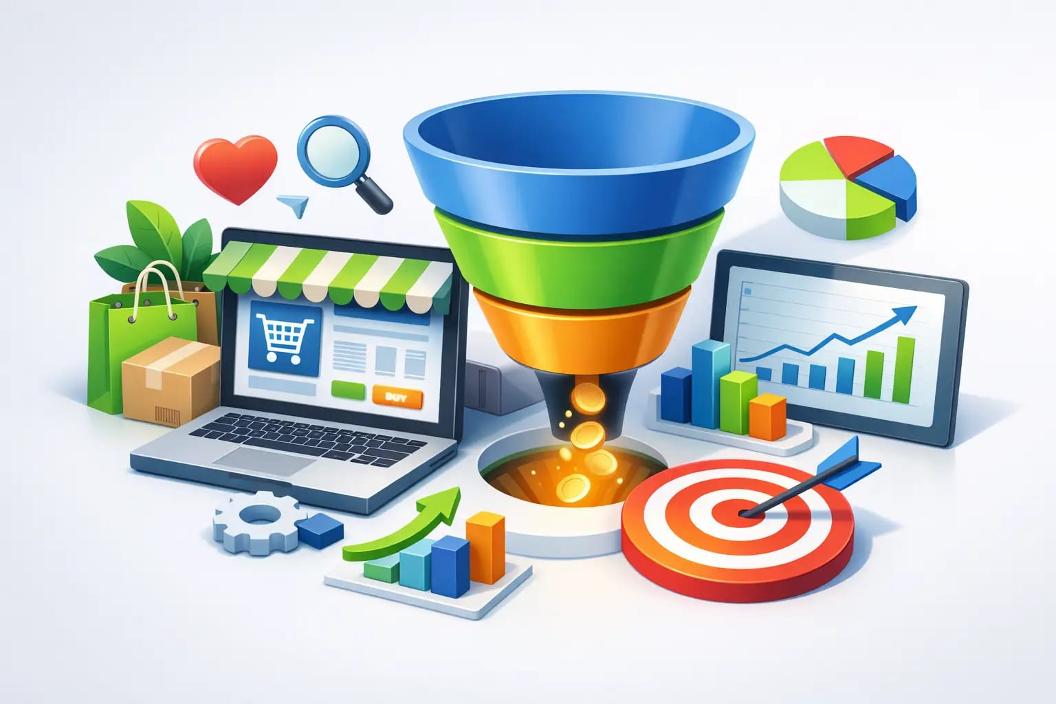
What a Shopify conversion optimization guide should actually focus on
Many store owners assume low conversion rates are caused by traffic quality alone. Sometimes that is true. But just as often, the issue is a mismatch between visitor intent and on-site experience. If your ads promise one thing and your product page communicates another, shoppers leave. If your site looks credible but makes pricing, shipping, or returns hard to understand, they hesitate.
A strong Shopify conversion optimization guide should focus on commercial clarity first. Your store has a short window to answer basic buying questions. What is this product? Why is it better? How much does it cost? When will it arrive? Can I trust this brand if something goes wrong? If any of those answers are weak, conversion suffers.
That is why optimization is both creative and strategic. Design matters, but not as decoration. Copy matters, but not as filler. Technical performance matters, but not in isolation. The highest-performing Shopify stores align branding, usability, messaging, and trust signals into one buying system.
Start with your highest-friction pages
If you want faster gains, do not try to redesign everything at once. Start with the pages that influence buying decisions most directly: your homepage, collection pages, product pages, cart, and checkout entry points.
Your homepage should not act like a brochure. It should orient new visitors quickly and guide them toward products or categories that match their needs. Strong stores lead with a clear value proposition, useful navigation, and a visual hierarchy that makes the next step obvious. If users have to work to understand what you sell, you are already losing them.
Collection pages often get overlooked, but they shape how easy it is to shop. If filters are limited, product thumbnails are weak, or pricing and product differences are unclear, users bounce before they ever reach a product page. This matters even more for stores with broader catalogs, where decision fatigue can quietly reduce sales.
Product pages carry the heaviest burden. They need to create confidence, answer objections, and make purchase decisions feel easy. That means stronger product imagery, concise benefit-driven copy, clear pricing, visible shipping and return information, and calls to action that stand out without feeling aggressive. If your product page looks attractive but leaves basic questions unanswered, it is underperforming.
Improve trust before you ask for the sale
Trust is one of the biggest levers in ecommerce, especially for newer brands or stores with modest recognition. People do not buy from a site just because it functions. They buy when it feels credible enough to justify the risk.
That credibility comes from several signals working together. Product reviews matter because they reduce uncertainty. High-quality photography matters because it helps customers understand what they are getting. Straightforward return policies matter because they lower the perceived downside of a purchase. Contact information, brand story, FAQs, and real social proof also help, but only when they feel genuine.
There is a trade-off here. Adding every trust badge and every testimonial widget can make a page feel crowded and overly promotional. The goal is not to overwhelm visitors with proof. The goal is to present the right proof at the right moment. A few credible signals placed where hesitation naturally occurs will usually outperform a page stuffed with reassurance.
Make product pages sell, not just describe
A common Shopify mistake is writing product pages like inventory records. Features get listed, dimensions get posted, and the brand assumes the shopper will connect the dots. Many do not.
High-converting product pages translate features into outcomes. If a material is premium, explain what that means for durability, comfort, or appearance. If a product saves time, reduces maintenance, or solves a recurring frustration, say that clearly. Buyers are not just comparing items. They are comparing confidence.
Visuals matter just as much as copy. Use multiple product images, lifestyle shots when relevant, and close-ups that help justify quality. For some products, video can improve conversion by showing scale, use, or texture more effectively than still images. But it depends on the product and the audience. For low-cost impulse items, too much content can slow decision-making. For higher-ticket products, deeper detail often increases conversion.
Your add-to-cart area should also do more work. Variant selection, availability, delivery timing, and payment options should be easy to understand. If a shopper has to search around the page for practical purchase details, you introduce friction exactly where intent is strongest.
Reduce cart abandonment with better timing and clarity
Many abandoned carts are not lost because the customer changed their mind about the product. They are lost because the final steps introduced surprise or effort.
Unexpected shipping costs, slow load times, mandatory account creation, vague delivery estimates, and distracting cart pages all chip away at intent. The closer a customer gets to checkout, the more damaging each extra obstacle becomes.
This is where clarity wins. Show shipping expectations early. Make discounts and promotions easy to apply without confusion. Keep cart pages focused on completion rather than stuffing them with too many upsells. Upselling can increase average order value, but when it interrupts momentum, it can lower completed purchases. That is an example of where optimization depends on context. If your average order value is low, a smart cart upsell may help. If your main issue is abandonment, simplification may create a better return.
Shopify’s checkout structure already removes some friction, but your pre-checkout experience still has major influence. The handoff into checkout should feel like a continuation of the buying process, not a new set of hurdles.
Speed, mobile usability, and technical friction still matter
Not every conversion problem is messaging. Sometimes the issue is simple performance. A slow site, unstable layout, or mobile interface that feels cramped can quietly erode sales across the board.
Mobile optimization matters most because a large share of ecommerce traffic now comes from phones. That means buttons need to be easy to tap, text needs to remain readable, filters need to work cleanly, and product images need to load without lag. If your desktop site feels polished but your mobile store feels compromised, your conversion rate will reflect it.
App overload is a frequent culprit. Shopify makes it easy to add functionality, but every app can introduce code bloat, visual inconsistency, or conflicts. More features do not always create more sales. Sometimes the fastest path to better conversion is removing clutter and streamlining the experience.
Measure behavior, not just traffic
If you want sustainable growth, your Shopify conversion optimization guide cannot stop at design advice. You need to understand where users drop off and why.
Traffic volume alone is not a performance strategy. You need to know which channels bring high-intent visitors, which landing pages hold attention, where users abandon the funnel, and what devices convert best. Heatmaps, session recordings, scroll depth, and checkout behavior all add useful context. So do basic ecommerce metrics like add-to-cart rate, checkout initiation rate, and revenue per visitor.
The key is to avoid changing too many things at once. If you rewrite product copy, adjust page layout, add urgency messaging, and change shipping presentation all in the same week, you may see movement but not know what caused it. Strong optimization is iterative. Test, measure, refine, and scale what works.
That is also where a growth-focused agency can create an edge. When design, SEO, messaging, and user experience are aligned, you are not just improving aesthetics. You are building a more effective sales engine.
Shopify conversion optimization guide for brands ready to grow
The most valuable takeaway from any Shopify conversion optimization guide is this: conversion gains usually come from sharper fundamentals, not flashy changes. Stronger positioning, clearer pages, better trust signals, faster mobile performance, and fewer buying obstacles will outperform guesswork almost every time.
For small to mid-sized businesses, that matters because efficiency matters. You do not always need more traffic first. You may need a store that does a better job converting the traffic you already have. That shift can improve ad performance, increase return on SEO, and create more revenue from the same marketing investment.
If your Shopify store is attracting attention but not producing the sales it should, treat that as an opportunity, not just a problem. The gap between visits and purchases is where meaningful growth often starts.